Banking services for the people
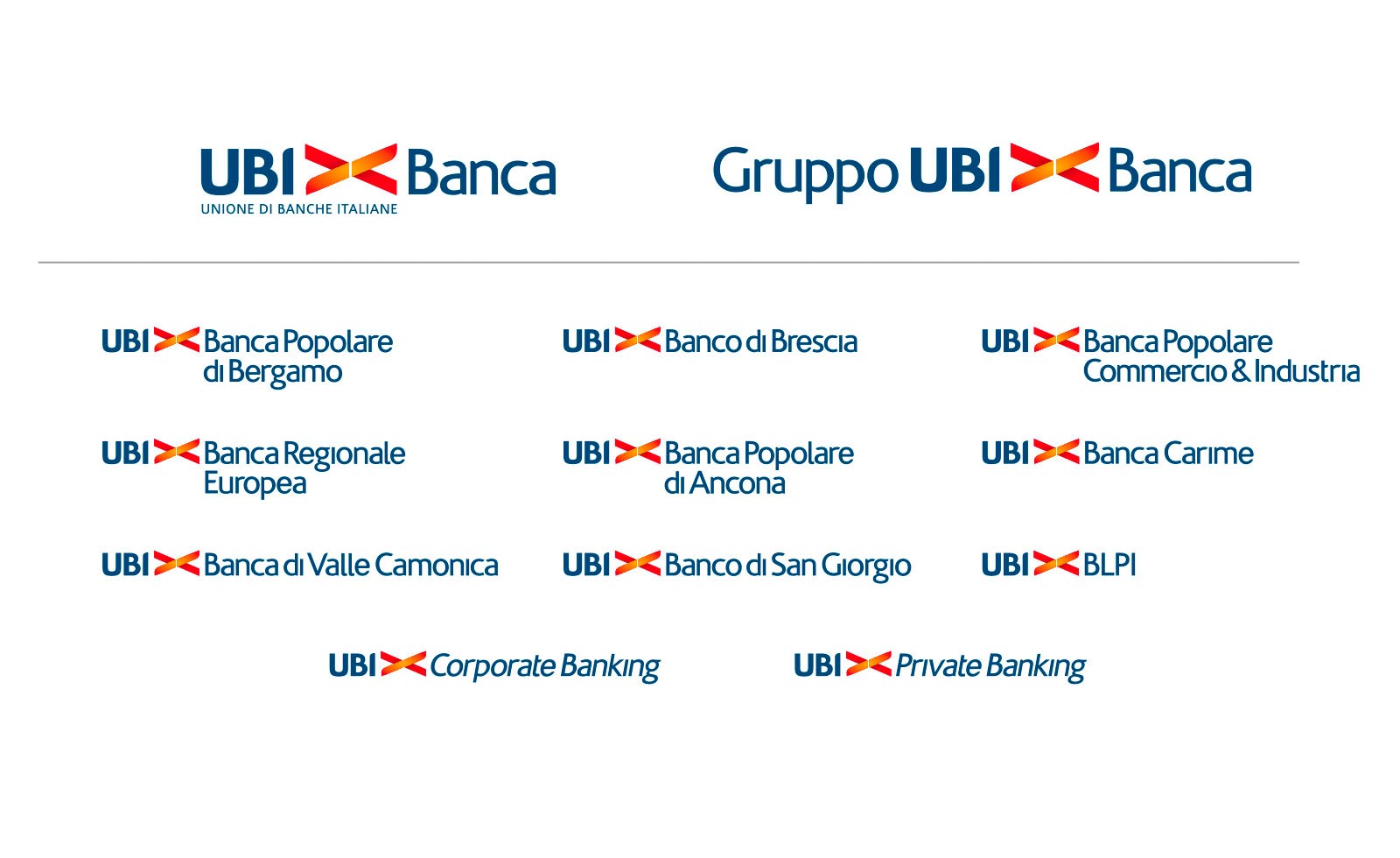
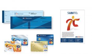
When the two bank networks BPU Banca and Banca Lombarda merged, they gave birth to one of the main bank groups in Italy: UBI Banca. A complete branding operation was needed to bring all the group together in one bank. A new symbol was designed mixing the colours of the two networks, red and yellow, keeping the shape of BPU’s icon.
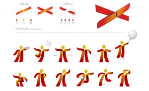
This branding task was very extensively executed, including the complete range of applications. Starting with strategy and positioning, the brand was designed and developed across both consumer and corporate communication. Design System and visual language were created, including a mascotte: a humanised version of the symbol. Applications e.g. were done on BTL materials, Advertising format, ATM interface, credit and debit cards, checkbooks etc. Also the sign system was created from scratch, including special signs for branches located in historical centres.
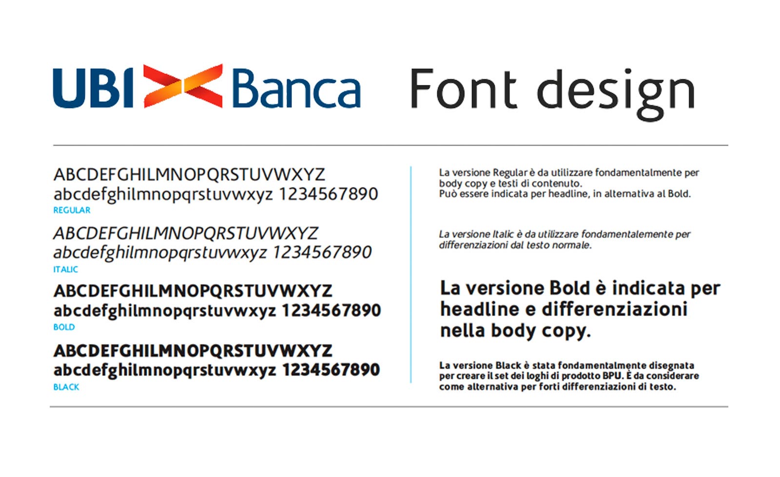
In order to add uniqueness and personality to this new network, a custom typeface was created for UBI Banca. This font is their only official type: firstly used for creating all the bank brandmarks, it’s used on all the communication materials.
Project developed for Lumen


