Spuma di Sciampagna, historical traditional Italian brand in bodycare, jumps ahead
Spuma di Sciampagna is a very well-known brand in Italy. They do bodycare and detergent products since the thirties, and basically they have kept their original identity until very recently.
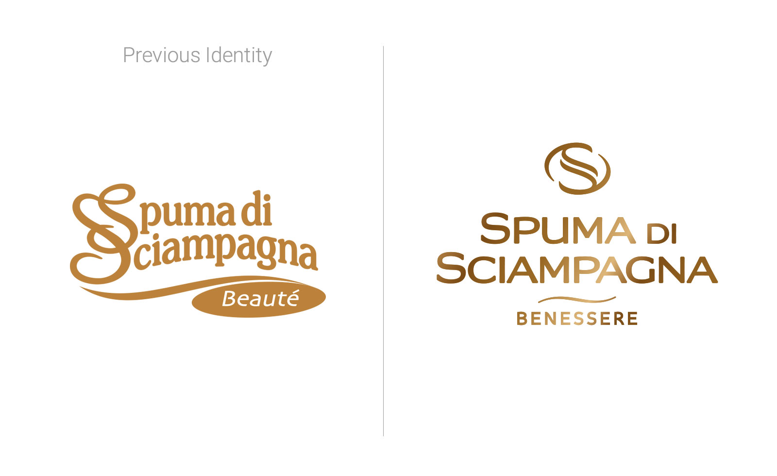
Beside the need of a total fresh rebranding, there was also a need to differentiate the bodycare lines from the detergent cleaning products, in order to push the brand towards a higher perceived quality.
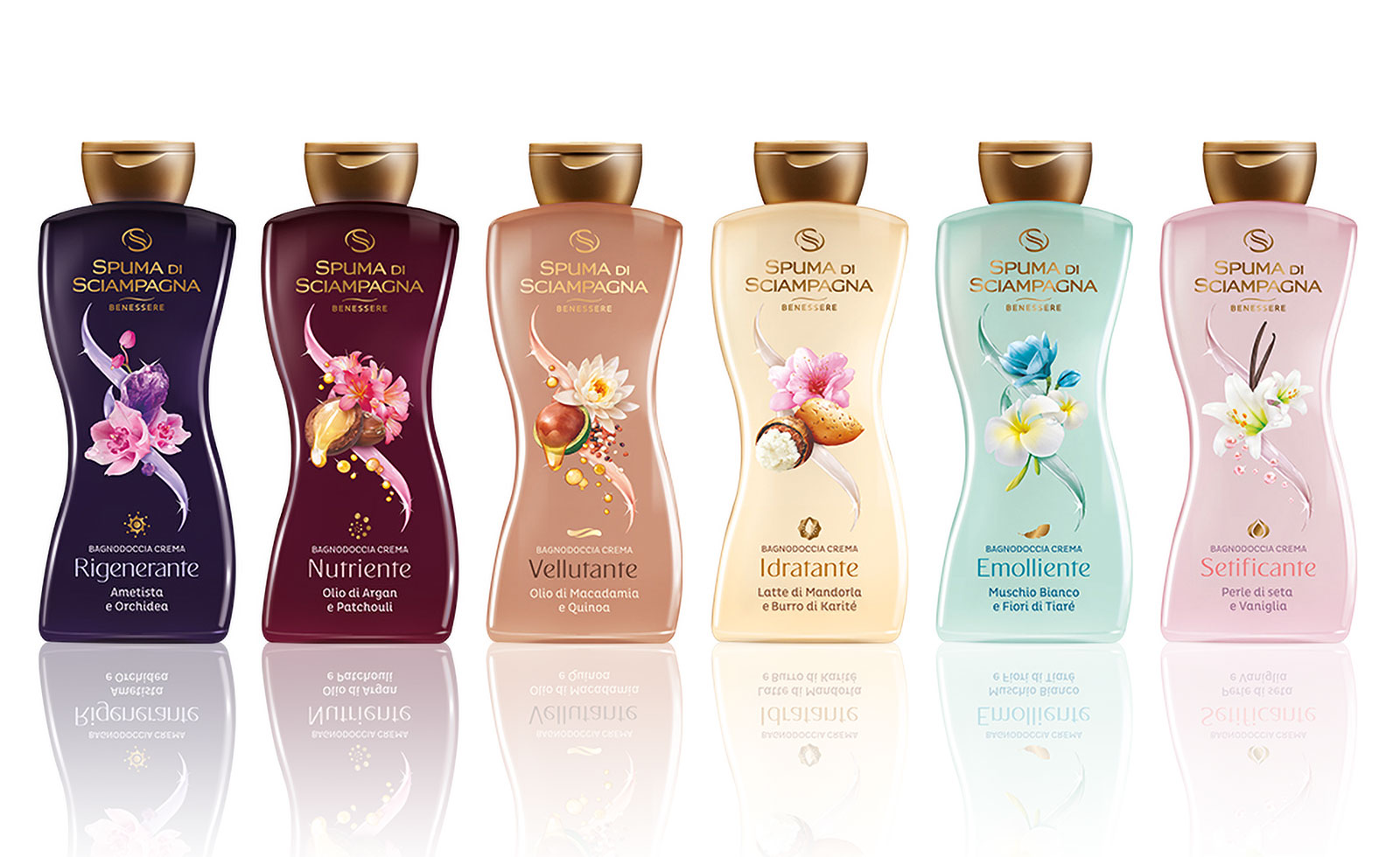
The New Logo carries humanistic values of elegance, delicateness and culture in a modern and luxury look. Using the gold foil colour it appears on top of a completely new label, designed to emphasise the ingredients and recalling to the initial S of the Spuma di Sciampagna brand.
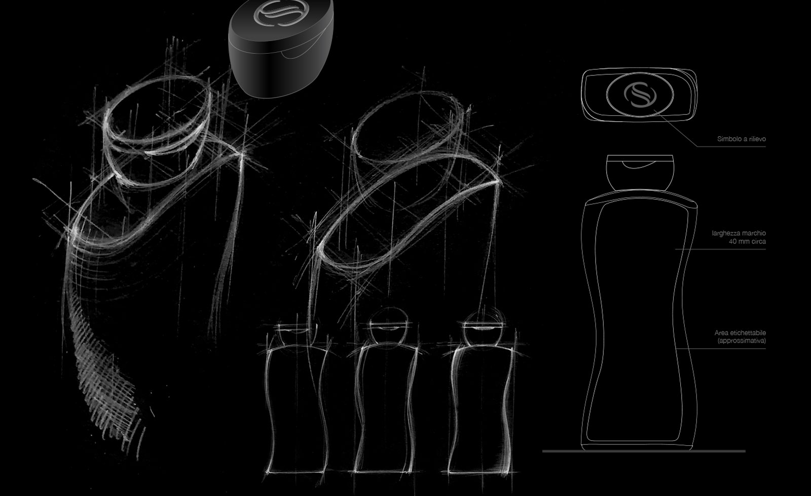
The packaging has been completely redone from scratch. Its shape is inspired by the initial S and its curves aim to resemble the sensual feminine body, as the main customers of SdS are women.
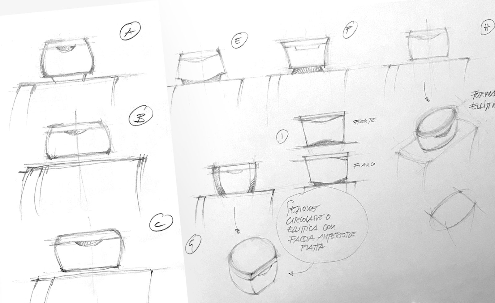
The cap embeds the new double-S symbol and has a flat top, allowing the bottle to be turned upside-down to use the last drops when almost empty, adding a practical point beside the aesthetics of its visual and tactile impact.
The 650ml shower cream product line is the main bottle, and it’s been awarded as Product of the Year 2020.
The design has been followingly extended by other parties to the rest of the bodycare products.
This work was part of a whole communication project done by Agency Lorenzo Marini.
