2021: Primadonna becomes Capitals!
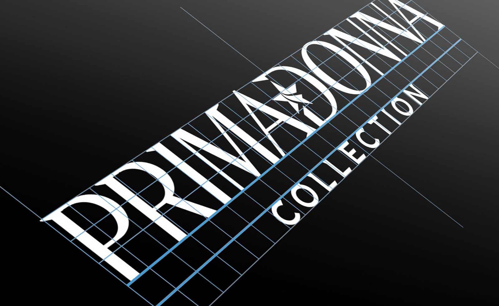
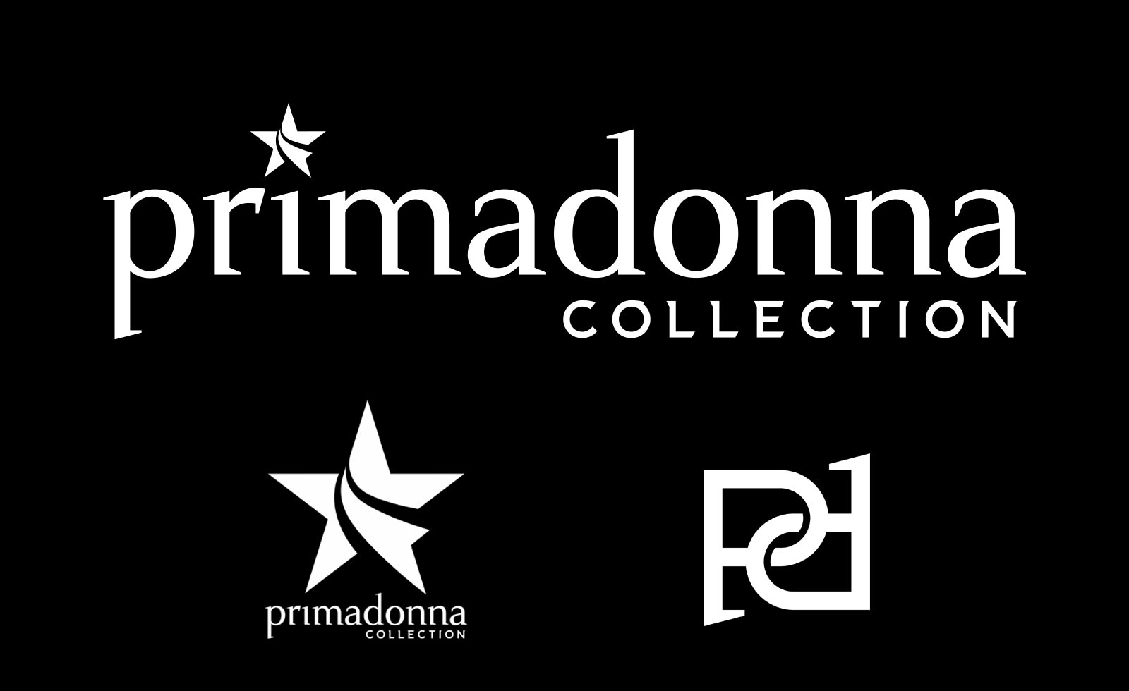
The brand evolved to be stronger, smarter and more mature, pushing the Brand Awareness further to a superior level. The Primadonna Collection rebranding is based on a completely new logotype, keeping the same type style but becoming all capitals. Elegance, fashion charme and strong style are the more-than-ever distinctive features of the new Primadonna identity, that naturally keeps its unique and original star symbol.
The type design, its proportions and all the details have been again crafted carefully, to highlight the high fashionable meanings of the Primadonna star: You.
Italian shoes and fashion to be a Primadonna
Primadonna Collection is the first shoes franchising brand in Italy, with stores worldwide. It needed a rebranding to enhance its trend and young factors, to eventually push the public perception of Primadonna to a superior level.
In Maggipinto Agency we faced an all-round rebranding operation, extremely comprehensive and deep. Starting with the identity, a modern minimal style was applied to create a new logotype, with a gentle feeling and a determined personality at the same time. The typography was completely custom designed, both for the main logo and for the underneath writing Collection, in elegant capital letters. A complete new symbol was created starting from the previous simple star. The star has in fact become a unique Primadonna symbol, resembling a star model with a price stripe.
The rebranding was then developed into its visual language creating design elements and Look&Feel, all contained in the Primadonna Collection Brand Guidelines. All the POS support materials were designed, beside the complete communication system: from the digital marketing to the window design.
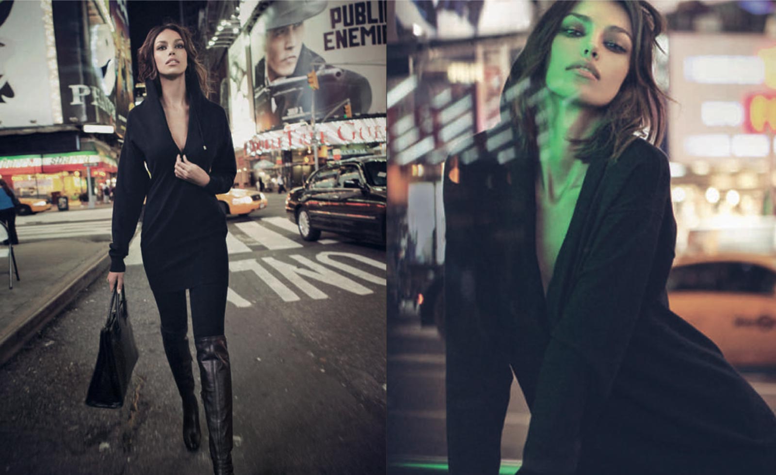
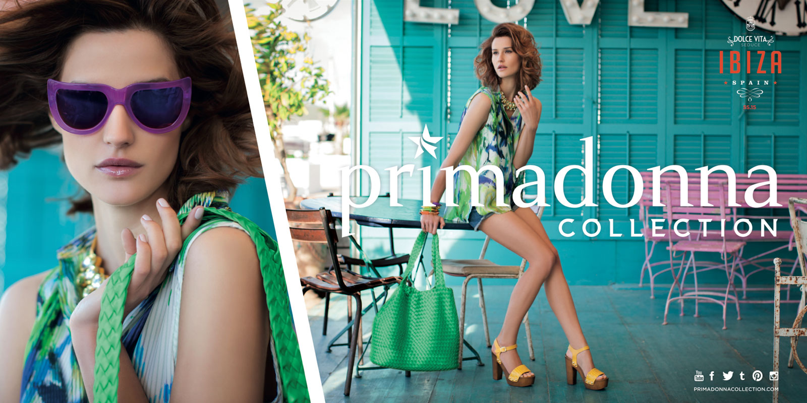
Advertising campaigns were created covering all media, from print ads to tv commercials. Model Madalina Ghenea was protagonist in one of the award winning tv ads made by Maggipinto Agency for Primadonna Collection.
Project developed for Maggipinto Agency


