Osey, the magic mix of Love and Shoes.
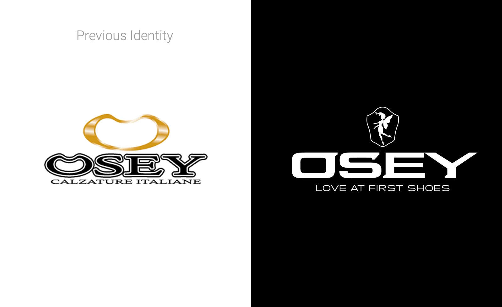
Osey was a brand that reached its max potential with their original image. In order to be able to make the jump to a higher level, a repositioning with a profound rebranding was essential. The need was related to the low public perception of the brand, but also to the functional usage factor. A more sophisticated design, based on clean and strong shapes, would allow making brand applications on all the Osey shoes production range, eventually strengthening the brand itself.
Except for the name, the identity had to change completely. A typography was custom created to embody concepts of coolness, modernity and pride. The previous symbol was totally abandoned, to create a new icon introducing a mythical character, specifically designed: a nymph with shoes. A new payoff was created too, replacing the former descriptor: now, Osey means Love at First Shoes, a memorable and seductive message.
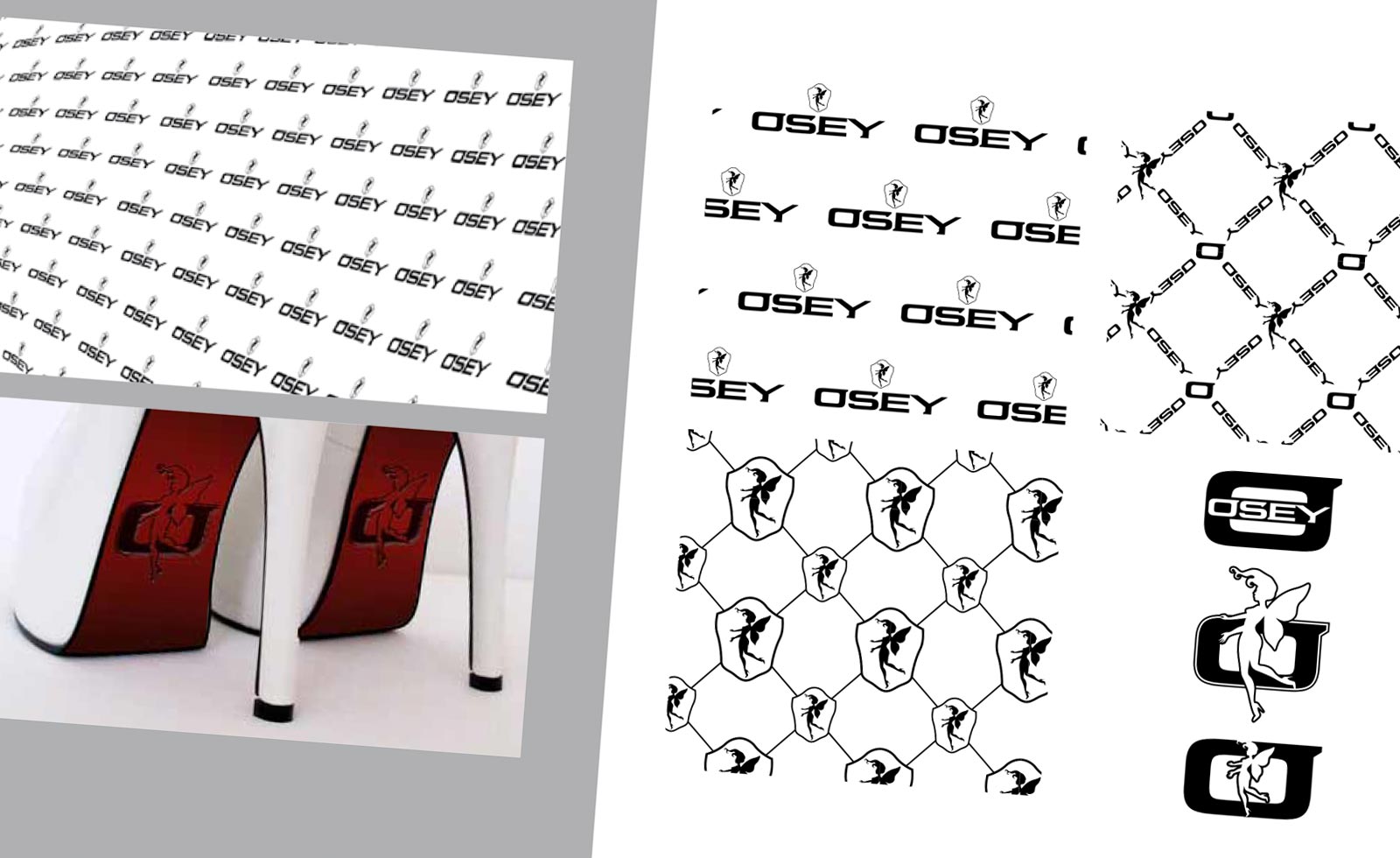
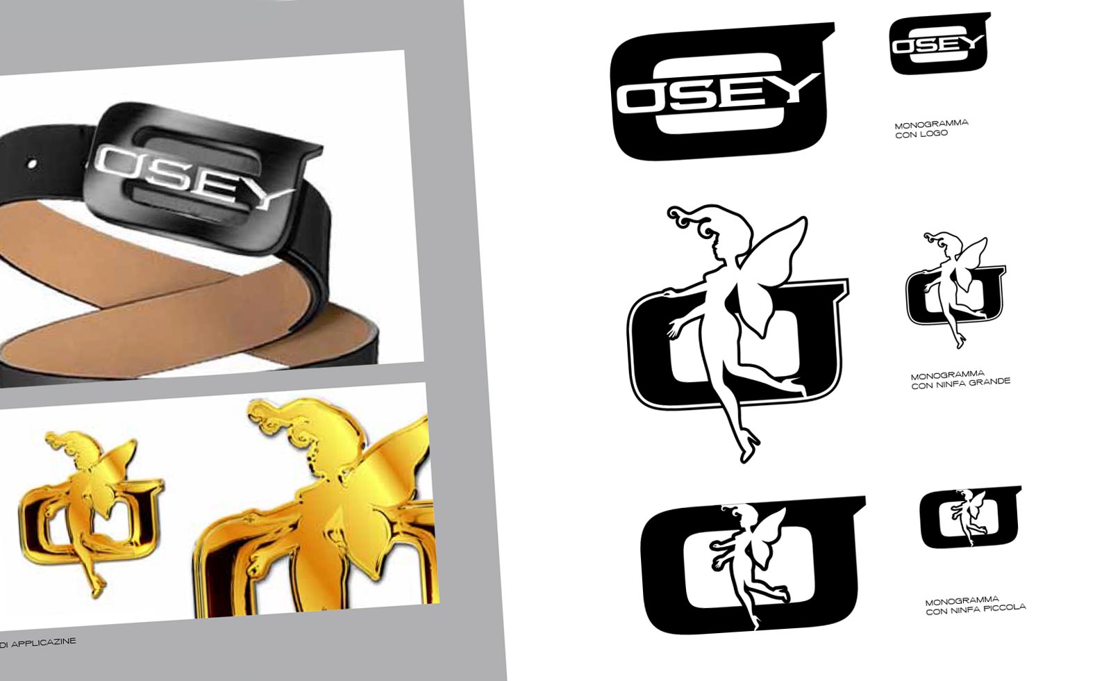
The identity was so remade from scratch, generating the new brand world of Osey. The new logo was now ideal also for creating new physical details on the products, both with or without the symbol.
New Design Guidelines defined the Osey style, containing all the branding elements necessary to develop the brand in the future. Beside the Brand Manual, complete sets of POS and BTL communication items were designed. Print advertising campaigns were created, managing photo and video shootings also for backstage footage to be published on the web.
Project developed for Maggipinto Agency


