A global toys brand
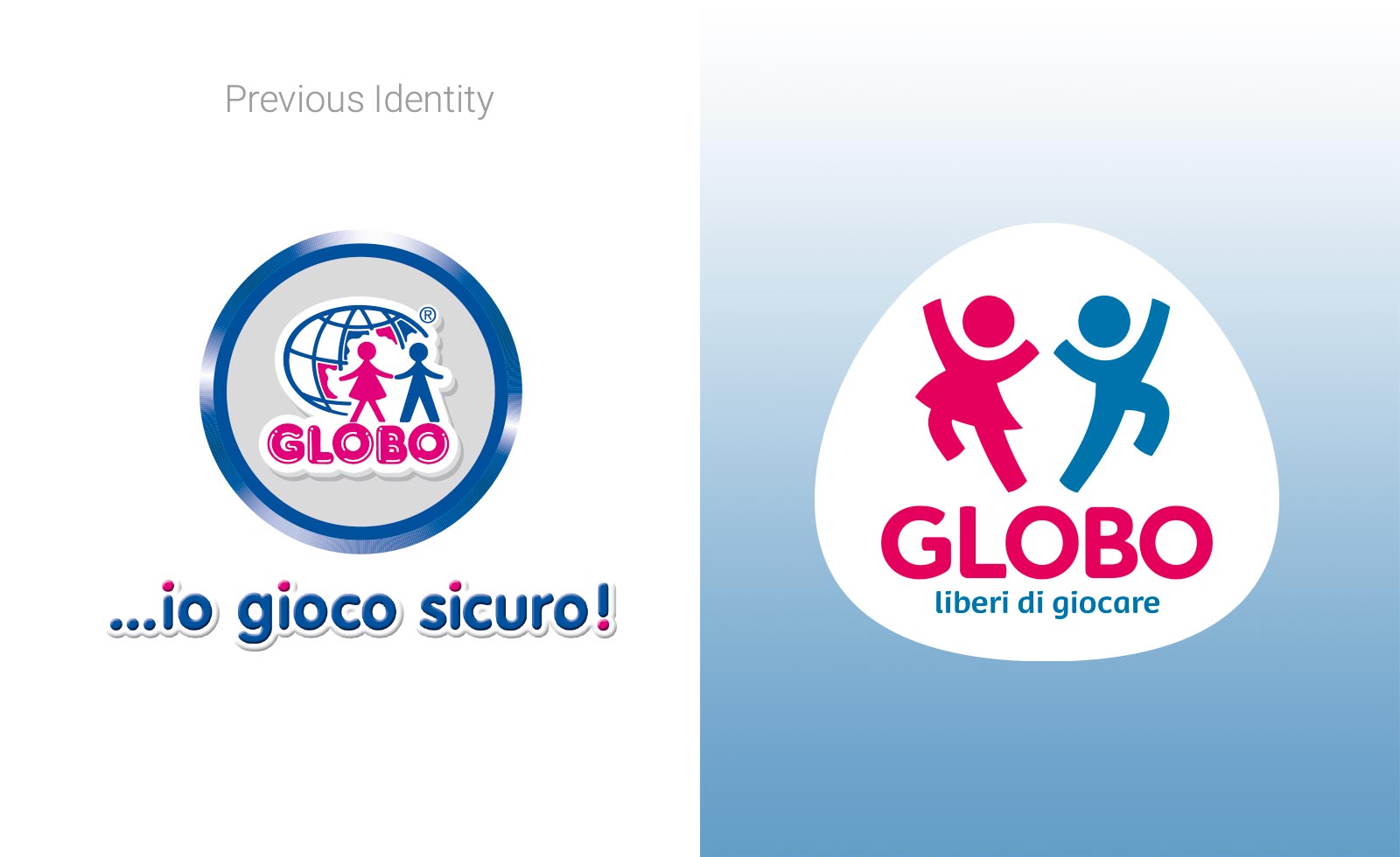
Globo Giocattoli, a leading Italian brand in the toys industry, had an identity based on design standards of the previous millennium. The growing chinese competition on the global market changed the public perception of Globo as a brand, misleading the opinion on the brand origins. In fact, people started thinking that Globo was Chinese rather than Italian.
A thorough rebranding operation was a mandatory as Globo was to be repositioned to gain back the public opinion approval. The remaking had to be radical, yet keeping a link to the past of this glorious company. The key was to simplify the brandmark, mainly adding to it personality, memorability and confidence.
The colours were slightly shifted to be more modern and all the 3D effects were removed. A gentle, delicately rounded typography was designed and a totally new style was introduced to redesign the entirety of the logo.
Clear and sweet lines shaped the new kids icon with their dynamic action of jumping up. A smooth and friendly outer shape was designed to contain the logo and its new payoff, meaning “free to play”.
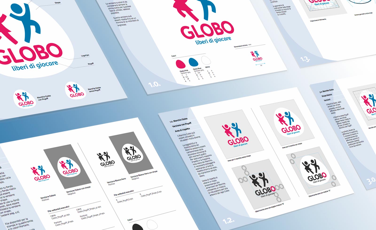
A Design Guidelines complete with branding elements was released for all the Globo international suppliers. Templates for their toy lines packagings were released too, to transfer the new positioning onto the Globo Giocattoli products.
Project developed for Volonté


