The pink newspaper of Italy
When La Gazzetta dello Sport, one the best selling newspapers in Italy, faced the time of a format change and a repositioning, a rebranding was needed to make possible this transition.
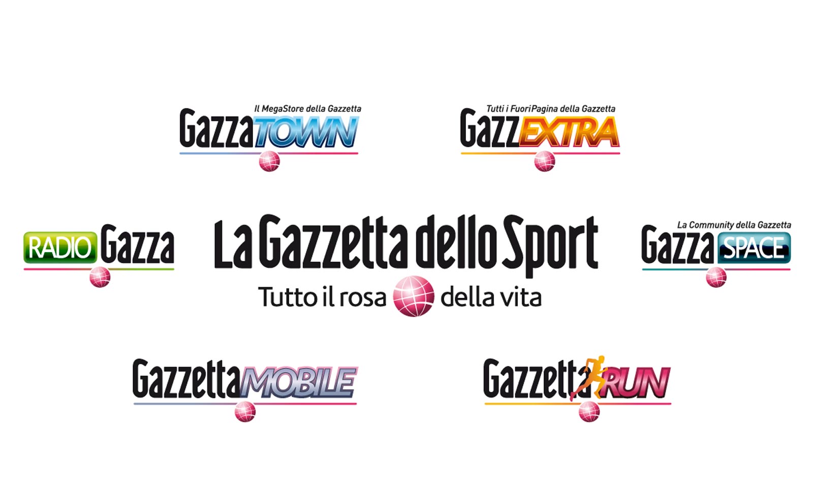
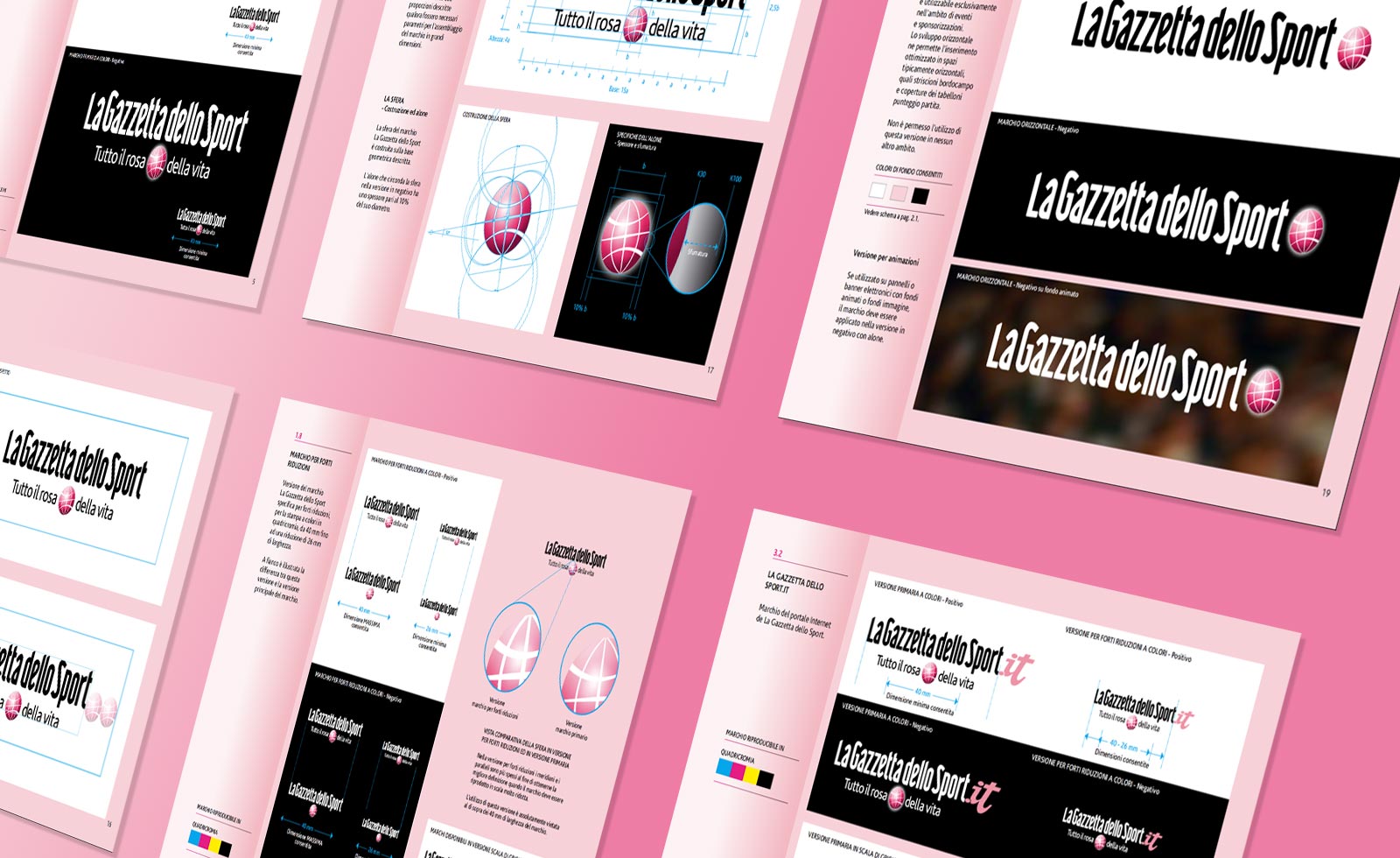
To resemble the introduction of news beside the sports news, a new icon was designed: a pink globe, surrounded by the new payoff meaning “all the pink side of life”. The type style needed to change too, getting rid of details and serifs, to appear more modern and contemporary. A new, custom made type style was designed, more minimal and clean, to be ahead of time. A complete typeface was designed and made available as digital font, to be used on all the initiatives that La Gazzetta dello Sport runs all over the year. A set of logos were in fact created, generating a brand architecture based on typestyle.
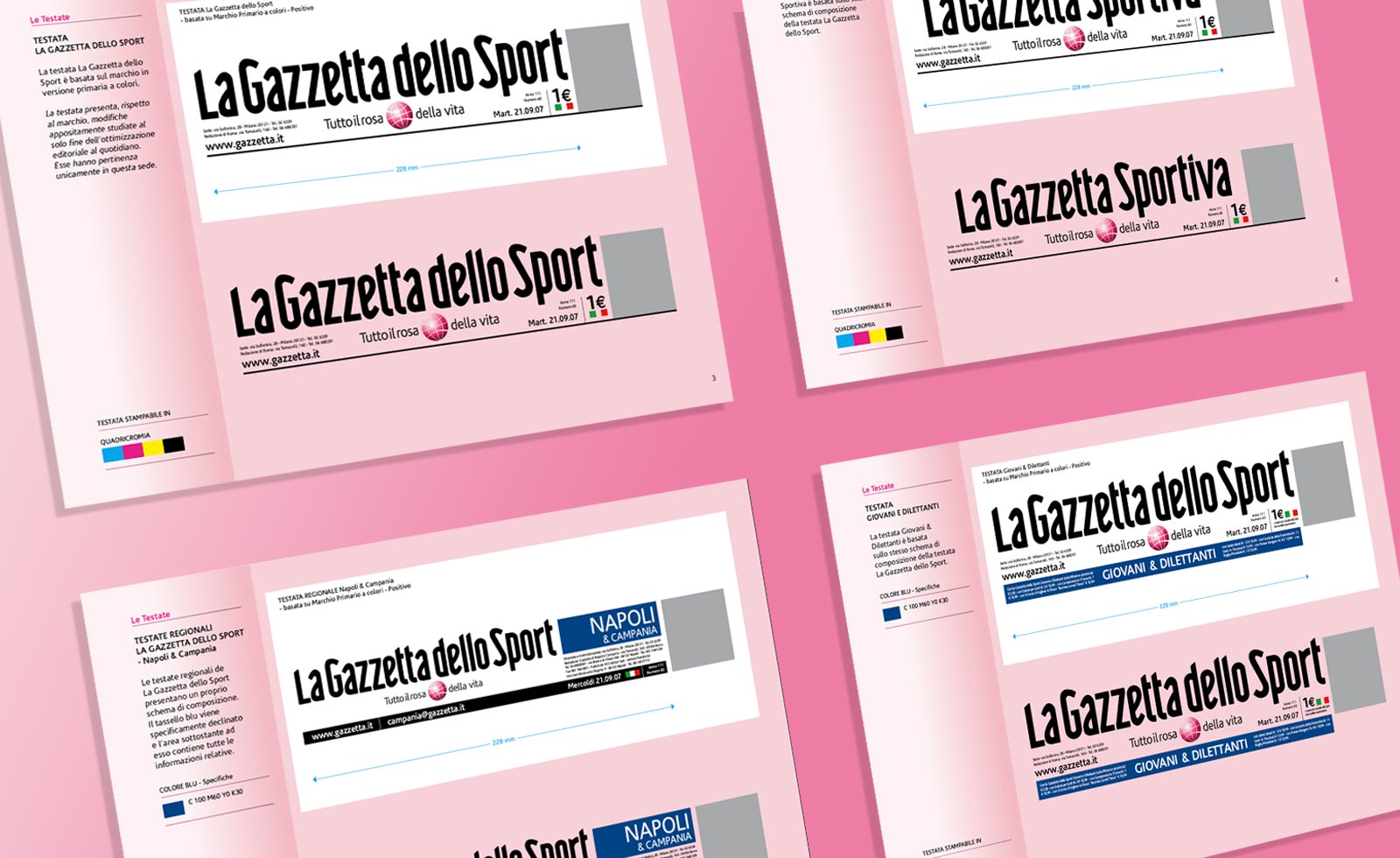
A series of new mastheads were made for the regional newspapers too and Brand manuals were released both as Design Guidelines and Brandbook. They contain all the elements of the newborn brand architecture, that replaced a previous situation where every single initiative and project of Gazzetta dello Sport was isolated and different.
In line with its new style, La Gazzetta dello Sport required also redesigning the Giro d’Italia identity. Please see the relative section.
Project developed for Lumen


