Britannia, the cookers for tasty food.
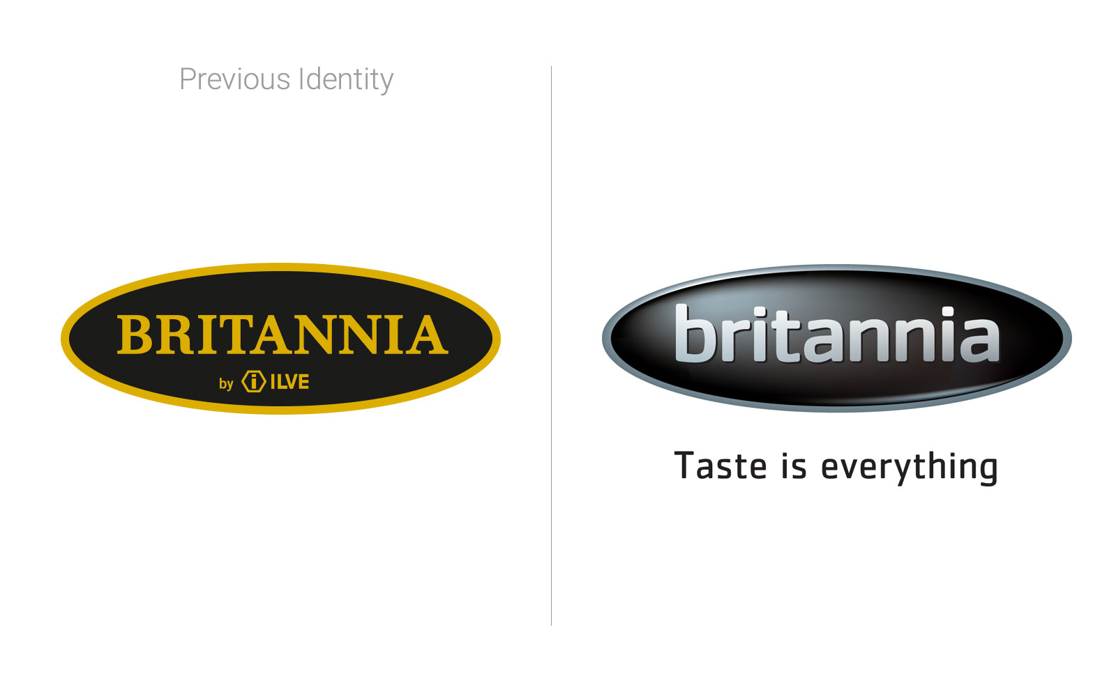
When at Britannia Range cookers they decided to move on from being directly related to ILVE, the Britannia identity had to be updated, redesigning a new brandmark in order to show the brand new personality.
A redesign project was executed, creating a new wordmark in a totally different style: gentle lowercase letters, with a strong character thanks to a rigorous design. The result was a balanced mix of technology feeling and easiness. Colourwise, the gold was abandoned to create a new look: shiny black and silver, meaning young and modern. Finally, after establishing the institutional typography, a new payoff was integrated, outside the logo shape: “taste is everything”, focusing on the enjoyment function of the cookers, so more customer related.
The Britannia badge shape remained the same, to allow implementing the new brand onto the cookers in production.
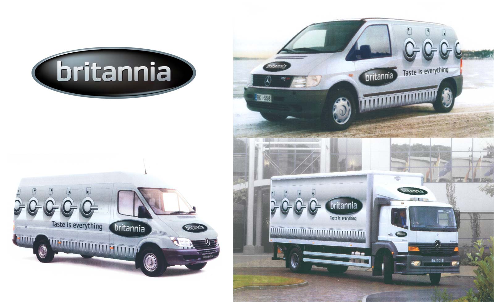
After the brand redesign, BTL materials and catalogues were produced and promotional adverts were done, beside the company vehicles dressed like giant cookers.


Project developed for Bates UK


